Safely
App Design
The current health context pushed us to re-organize our daily life in all its aspects. The French Minister of Health & Prevention was in need of a tool that would encourage people to start taking the public transportation again and reassure them after Covid-19.
THE BRIEF
THE ASK
SKILLS
Create a full 360 identity to reintroduce Ironbodyfit to the US market. Adapt the communication to new targets and adjust brand identity to fit the market.
Marketing
Art Direction
Graphic Design
Content Creation
Video Editing
LOGO
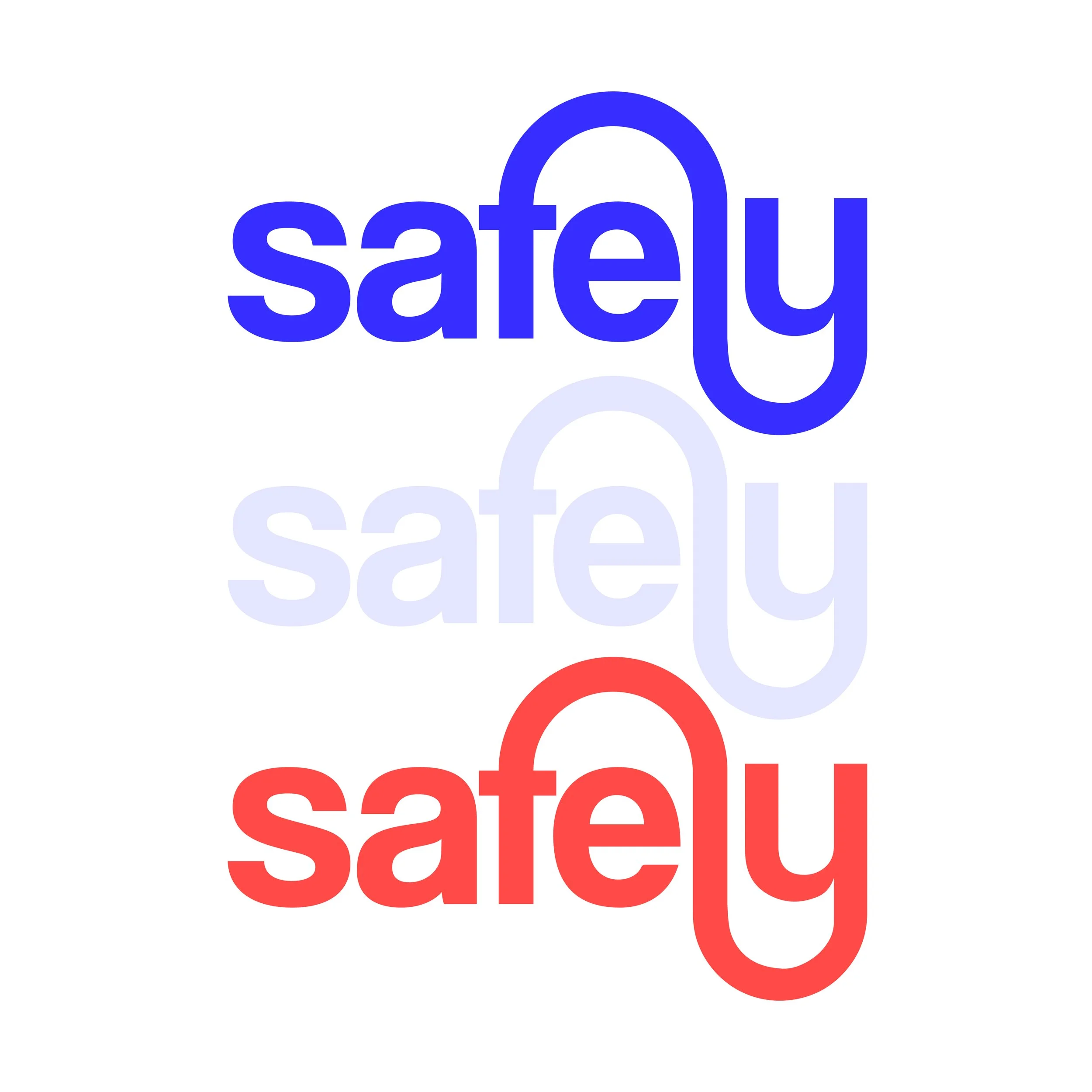
The logo represents the movement of going from a point A to a to a point B in a very round way to emphasize on comfort, warmth and smoothness. Inspired by a lock, it also gives a sentiment of safety to have users feel like they are riding safely and protected. The “e” acts as a person on its journey.
COLORIMETRY
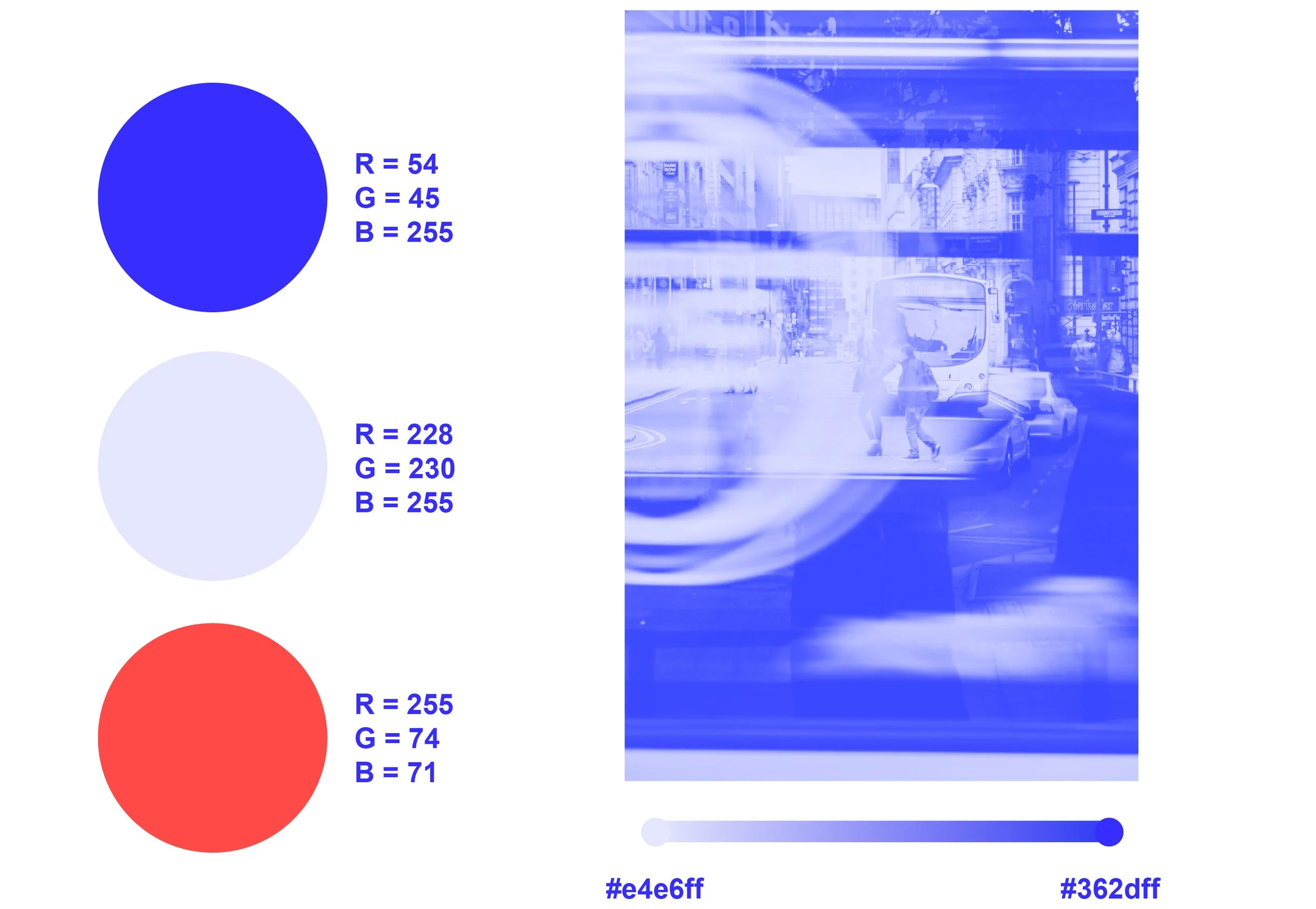
The palette is a contemporary take at France’s national colors blue, white and red. It offers a distinct balance between hot and cold and a reassuring, governmental control of the app. Images are treated with hues of blues with a slight grain to bring a more authentic effect.
Get There. Safely.
One App. Endless Possibilities.


